
WordPress has always been my Go-To method for creating new websites and experiences, either for myself or for my clients.
But WordPress’s way always felt lacking, lacking blocks and options to make my designs come to life. So, I often defaulted to using third-party builders for WordPress, where I get more freedom with options that I can tinker with.
Recently, WordPress released a Design System, which is a bit of a step up to unify and give more power and consistency to the Gutenberg block editor by giving the designers the insights and tools that the WordPress Developers are using. This was a much-needed release for us designers to get a sense of a guideline on how the teams inside WordPress Operate.
Now, instead of complaining about Gutenberg Blocks being behind, I decided to actually start contributing to the project using their design system that was released on November 7, 2024.
After taking a look at the current available blocks, I have decided that my first contribution should be two Blocks: a new Table of Contents and a Back to Top button.
The Why
This can be answered shortly: they're Missing! But that’s not the only reason.
Having a Table of Contents and Back to Top button is a must-have for all kinds of websites, from your standard block to your project documentation,to even your home page.
Implementing a table of contents is usually a painful process – from a design point that is- since usually it’s hard to find something that will look good on your desktop and your phone at the same time, and each comes with its own set of issues.
Your Standard in-page ToC will take a lot of space on both desktops and phones, and each time you need to navigate, you need to scroll all the way to the top to change the section you need. Maybe you use a fixed sidebar, which can be good on your desktop, but it will force a design decision that you don’t necessarily want. It also comes with its own set of issues.
On the other side of the breakpoint, having a long ToC can be super annoying. And that fixed sidebar that you had to use on the desktop will not be good.
As for the Back to Top button, it's usually not that hard to emplement, but why not make more that just a button that scrolls you to the top? Why not make it a button that is actually informative?
The Proposal
Knowing all that, I started designing two new blocks for Gutenberg that can -ideally- fix the missing blocks issue and have them be a good solution that will make life easier for develeopers and users alike.
Let's Talk Tables
The suggested Block will operate on a two-style method, both of which try to compensate for their respective drawbacks.
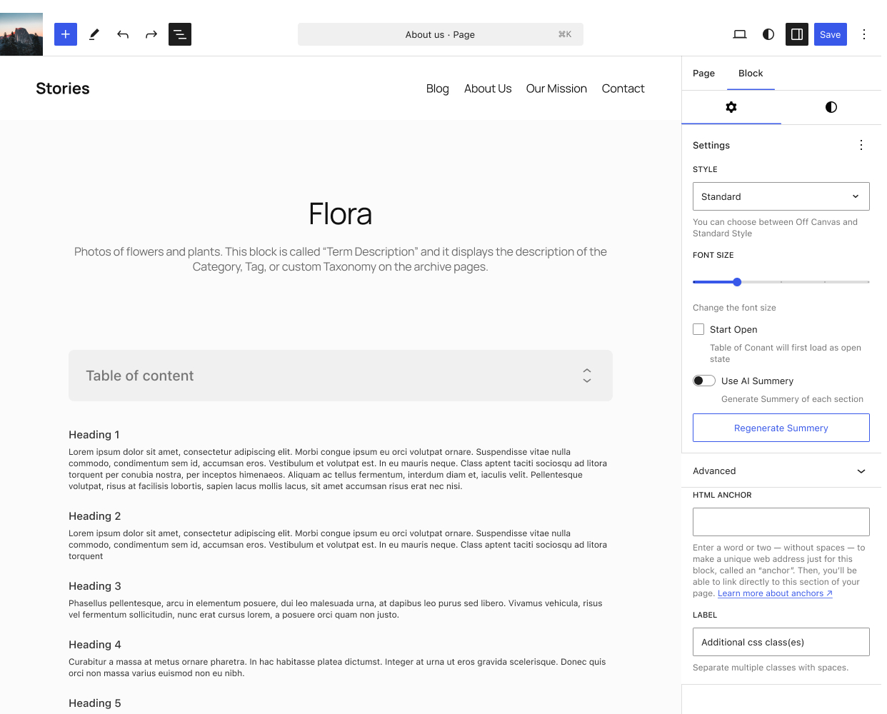
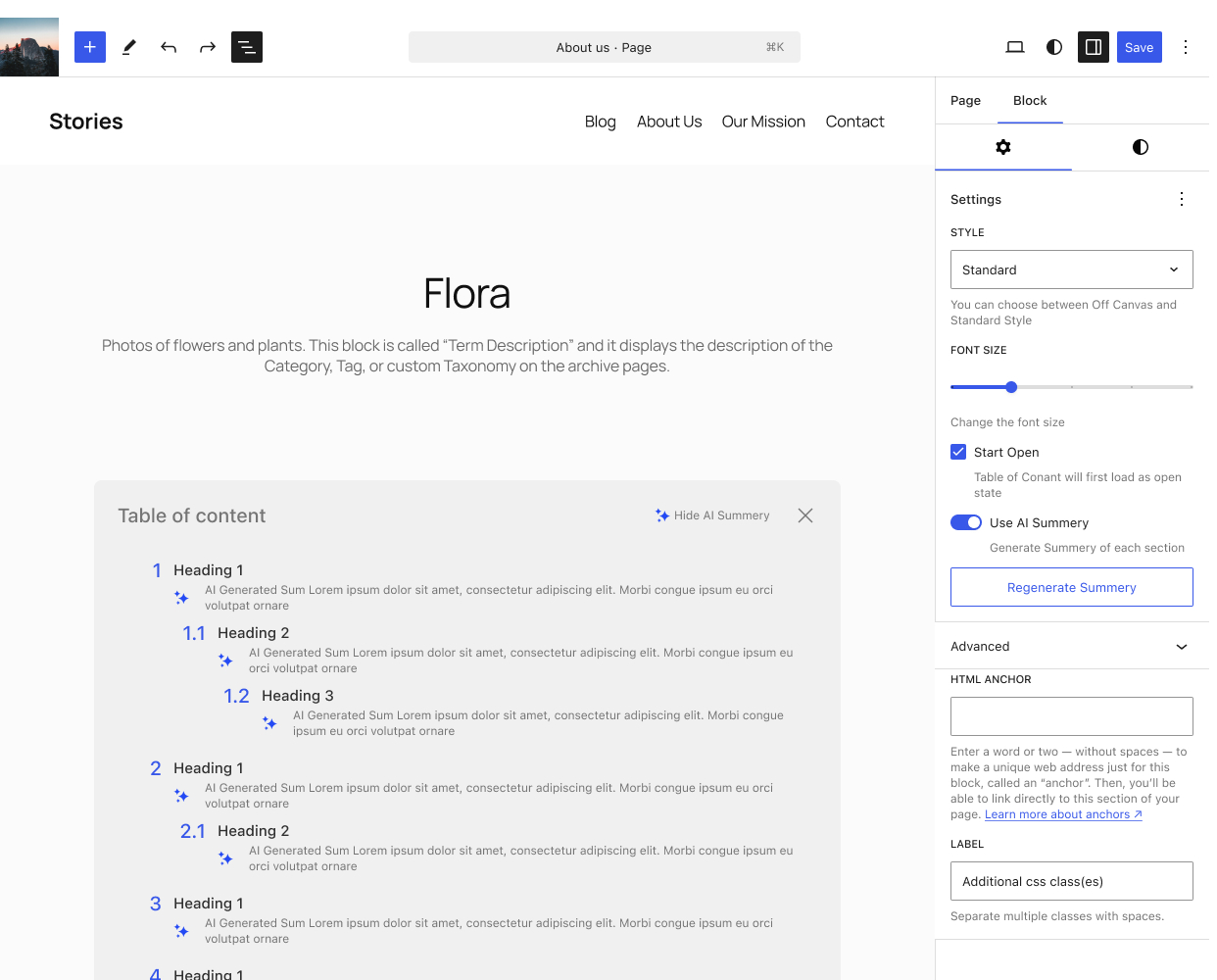
Style 1: Standard
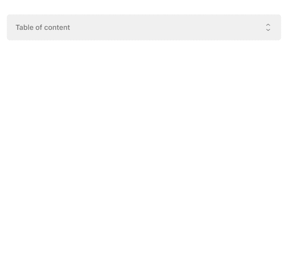
This is your standard list of titles with a collapsible layout that will navigate you to where you need to go, but with a twist: Is knowing the title of each section enough? To be honest, most likely no.
To combat that, I implemented an optional AI Feature that will generate a short summary for each section.
This small addition of an optional summary will help users jump in to where they need to go directly, or at least be sure that they’re headed the right way.
Now what if you don’t like the summery; well we have two options for you: you can either regenerate the the summery with a simple button click, or if you fell like it’s just ai clutter, you can simply turn it of, and don’t worry.. the generation will only be once, so it will not change each time someone loads the page.
Style 2: Off-Canvas
This option is for my minimalist friends, a simple button that will stick to the side of your screen. You click it, and it will show you where to navigate.
Taking too much space? Click the close and puff, it’s gone, and you can read freely.
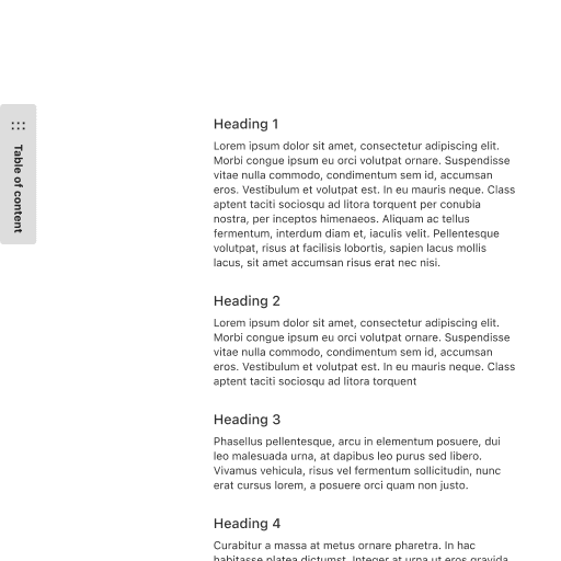
The simple interaction for opening and closing is what makes the style so powerful; it will look good on desktop and mobile devices alike.
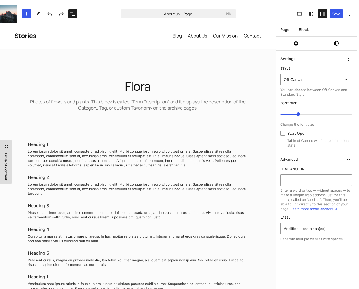
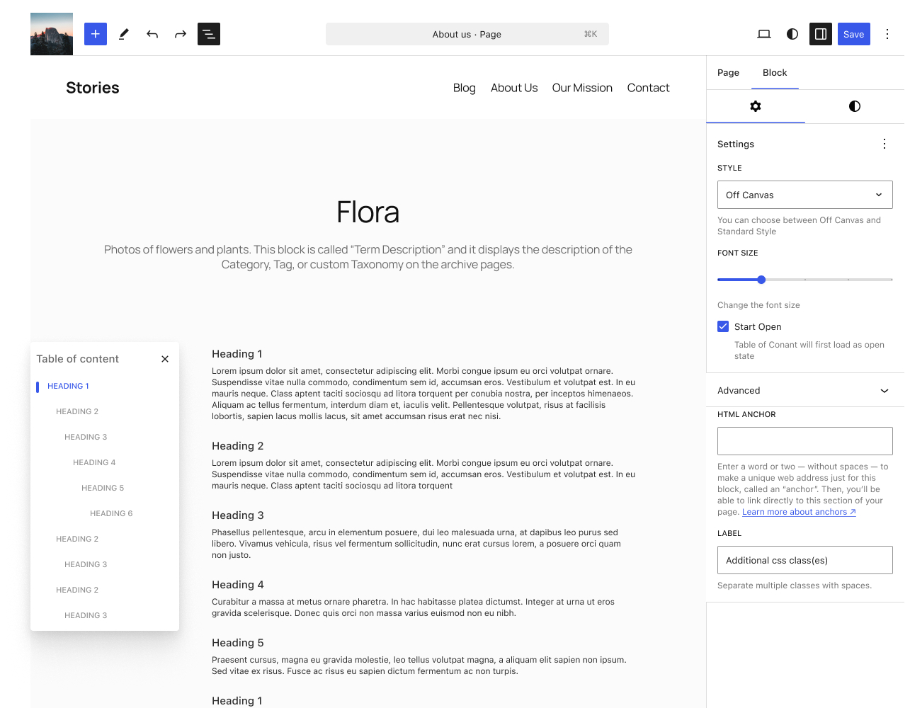
As for the options you don’t get the AI Summary with, since it defeats the purpose of it being small and minimal, but you get the option to have start open -as you do with the standard style- which will make it functionally a fixed sidebar on desktop if you want, with a close/hide icon that is.
Now we Jump Up
Since I'm a big fan of functional minimalism, I thought why not have the button be useful instead of just it sitting pretty in the corner? Why not have it carry information?
I built the first iteration of the button so it animates nicely on the screen, then I wrapped it around with a circular scroll indicator. My thought process was: if I need a button to go to the top.. I really need to know where I am

Doing that I ended up with a two-in-one block that can serve a higher purpose, and it looks good while doing it.
The Conclusion
This started as a simple experiment, but I’m really happy with how it turned out. I got to dive into the new WordPress Design System Figma library -which is pretty good, might I add- while simultaneously trying to be helpful to the project I love.
Hopefully, this will get more momentum and attention from passionate designers and developers alike.
This won’t stop here for me. I will use my basic knowledge of coding to try to make this an actual, functional Gutenberg Block that can be used by other people. Then, I will move on to the next idea for a new block!